Crafting a heritage identity for India's purest desi cow milk ghee — where tradition meets shelf presence.
Go Mata Originals approached us with a clear conviction — they wanted their ghee brand to communicate heritage, authenticity, and uncompromising quality at first glance. In a market flooded with generic packaging and hollow health claims, they needed a visual identity that would stand apart on both physical shelves and digital storefronts.
The Indian ghee market is deeply traditional yet fiercely competitive. The challenge was to create a brand identity that honored the age-old bilona method and desi cow heritage, while feeling premium enough for urban consumers and D2C e-commerce. We needed to bridge the gap between grandmother's kitchen and a modern health-conscious buyer's cart.
We drew inspiration from royal Indian typography, Mughal-era ornamental patterns, and the warm golden tones of ghee itself. Every design element — from the deep maroon and burnished gold color palette to the ornate filigree details in the logo — was chosen to evoke a sense of regal authenticity. The brand doesn't just say "pure ghee" — it feels like generational wisdom poured into a jar.
The brand should feel like opening a jar of your grandmother's ghee — pure, golden, and filled with love.
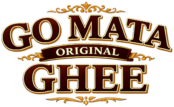
The Go Mata logotype was crafted with vintage slab-serif letterforms, layered with dimensional depth and a warm maroon-to-gold gradient that evokes the richness of pure ghee. The ornamental flourishes framing the type draw from traditional Indian motifs — creating a visual language that communicates heritage craftsmanship. The "Original" banner anchors the composition, signaling authenticity and uncompromising quality.
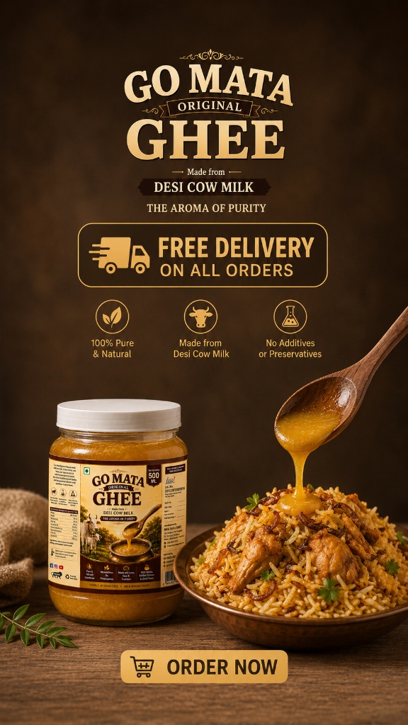
The packaging design extends the brand's royal aesthetic into a complete visual system. Rich brown tones create a backdrop of warmth, while the product photography — featuring golden ghee dripping from a wooden spoon onto steaming biryani — tells a sensory story that no amount of text could match. Every visual touchpoint was designed to stop the scroll, whether on Amazon, Instagram, or a supermarket aisle.
Every social media creative was built to convert attention into appetite. From product-first compositions to lifestyle moments, the visual system maintains brand consistency across every platform and format.
A brand film that captures the essence of Go Mata Original Ghee — the aroma, the purity, and the tradition behind every golden drop.
Go Mata Original Ghee launched with an identity that immediately commanded shelf presence and digital attention. The cohesive visual system — from jar labels to Instagram stories — created a brand that consumers recognize, trust, and actively seek out. The "Original" positioning carved a clear niche in a crowded market, while the premium aesthetics justified a higher price point that the product quality backs up.